Setup
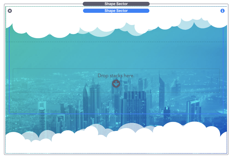
After adding the stack to the Stacks page you will notice that the stack’s background has been set to a gradient. This is so that the shape and color is visible in its default state. You can disable the gradient background in the stack’s menu “Background” section. If you intend to keep the shape’s color white, you will need to add a background color, image, or use a gradient background.
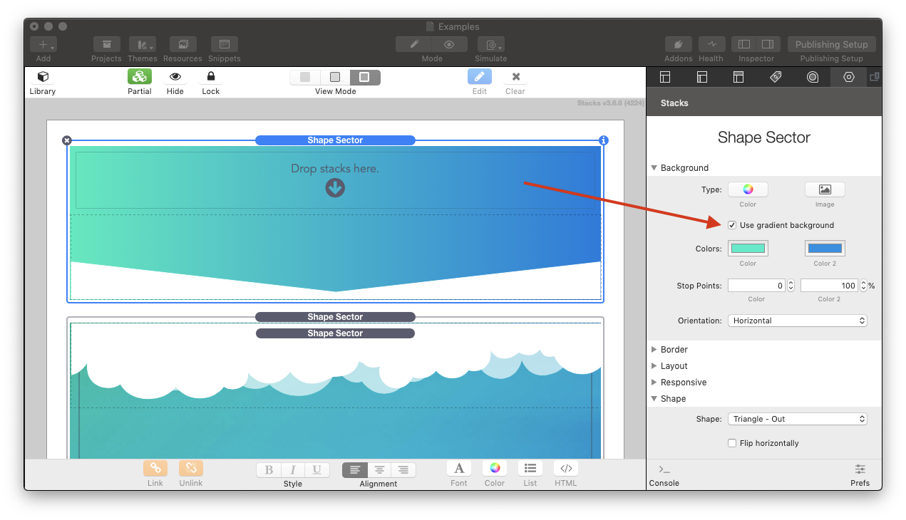
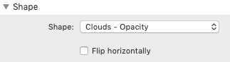
In the settings menu “Shape” section you can select from any of the 34 pre-made shapes and optionally flip the design to adjust the appearance.
There is also a custom option that allows you to add your own shapes. See the “Creating custom shapes” tutorial below to learn more.
By default, the shape will display at the bottom of the section. You can change its position in the stack’s menu “Shape Settings” section. This section is also where you can modify the style and size.
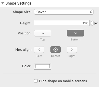
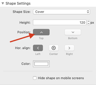
Generally, you will want to leave the shape size set to “Cover”, the height set to 120px, and the horizontal align to “Center”. You can adjust these options to get a different fit if you need to, but they are not necessary for setup.
Select a color for your shape and add a new Shape Sector stack (or any other section/column stack) below this one. The background of the added stack needs to be set to the same color to complete the section divider effect.
Settings Menu
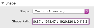
Shape: Choose from 34 shapes to divide your content. You may also select “Custom” to add your own path created with the shape tool.
Flip horizontally: Optionally flip the shape to change the direction of the design. This option is most useful for asymmetrical shapes or for when creating a section frame.
Shape size: Select how the shape fills the space between your sections. By default “Cover” will make sure the shape does not distort but will clip the left and/or right sides of the shape to make sure it covers the entire area. “Contain” will also make sure the shape does not distort but the entire shape will always be visible which may leave space to the left and/or right. “Fit” will cause distortion but the entire shape will always be visible without any space to the left and/or right side.
Height: Adjust how much space the shape takes up vertically. This will also adjust the size and/or fit of the shape depending on what shape size option you are using.
Position: Optionally move the shape above the content instead of below.
Hor. align: Change the alignment of the shape. By default the shape will be centered, aligning the shape to the left or right will change how it is clipped if the shape size is set to “Cover”.
Hide shape on mobile screens: Disable the shape on mobile devices.
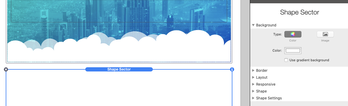
Creating section frames
You can create frames simply by nesting the Shape Sector stack inside of another Shape Sector stack.
You will need to select one of the two stacks and set it’s position to “Top” in the stack’s menu “Shape Settings” section. The shape will be flipped vertically or modified to match as the top part of the frame.
Creating custom shapes
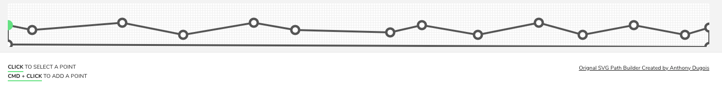
A shape tool is included when you download the stack. You can also use the online version found here: shape tool
With this tool you can create your own shapes to add to the Shape Sector stack.
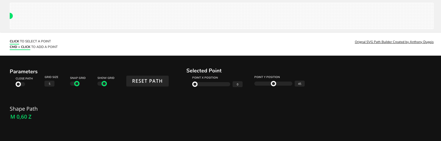
The artboard is 1440px wide by 90px tall and starts with a single point shown as a green dot. To add new points hold down the command key and click anywhere on the artboard grid.
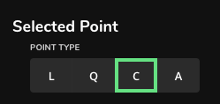
Each new point can be set to 4 different types. “L” is for “Line” and will simply be a straight line from the previous point. “Q” stands for “Quadratic Bezier” and will give you two handles to adjust the S curve of the line leading up to this point. “C” stands for “Cubic Bezier” and will give you a single handle to adjust the curve of the line leading up to this point. “A” stands for “Arc” and will create a circular shape between the selected point and the one preceding it.
Continue to add more points and adjust them to create a completed shape. Make sure your design covers the entire grid area from left to right in order to fit all device screen sizes.
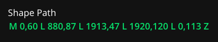
Once you are satisfied with the design, copy and paste the “Shape Path” into the Shape Sector stack’s shape path field. You can then use the stack’s settings menu to adjust how the shape fits.
Shape tool settings
Close path: By default the shape will automatically be closed. Disable the “Close path” option if you would like to close the path manually after completing the design (By adding a new point in the same exact position of the starting point).
Grid size: Adjust the size of the grid lines by px.
Snap grid: When enabled, newly created points and points that have been moved will automatically attach to the closest grid intersection.
Show grid: When enabled, grid lines based on the grid size will display on the artboard.
Reset Path: Will remove all the points from the artboard except for the starting point.
Point x position: The position of the currently selected point along the x or horizontal axis.
Point y position: The position of the currently selected point along the y or vertical axis.