Setup
This stack has 4 different modes for achieving different effects and designs.
- Edge creates large background graphics that extend to the browser edge.
- Image allows you to place large images that sit outside the content area.
- Shape creates large background graphics that are contained inside the content area.
- Object creates shapes that behave like images and can be placed inside any stack that supports content.
Edge, Image, and Shape modes are background graphics and when using these modes the stack is intended to be used as a wrapper for your other stacks. Object mode is for placing inside other stacks. Below you can find a setup tutorial for each mode.
Edge Mode Setup
To get started, add the Image Sector stack to your stacks page. By default the stack is set to Edge mode.
While in Edge mode, it should not be placed inside of another stack. Placing it inside of another stack may disable the ability for the graphic to extend to the edge of the browser window.
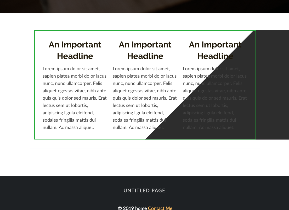
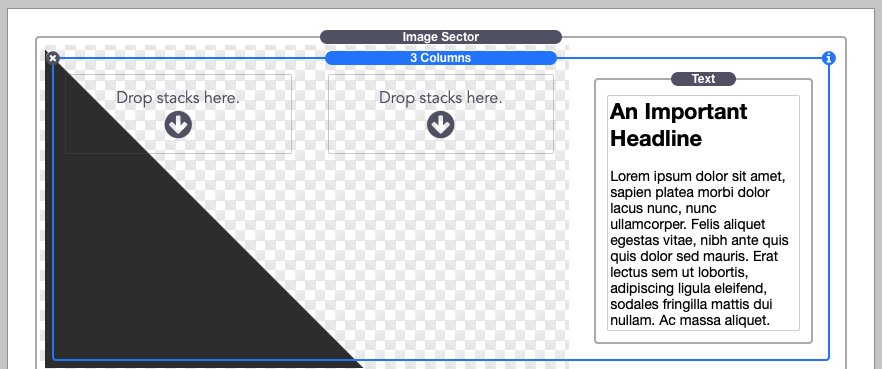
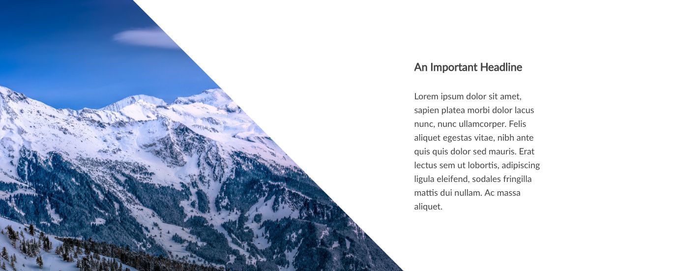
Next select a shape to use. You can also select “Custom” to add your own, more info on that in the “Creating custom shapes” tutorial below. In this example we will be using the “Triangle right” shape and placing a 3-column stack inside Image Sector.
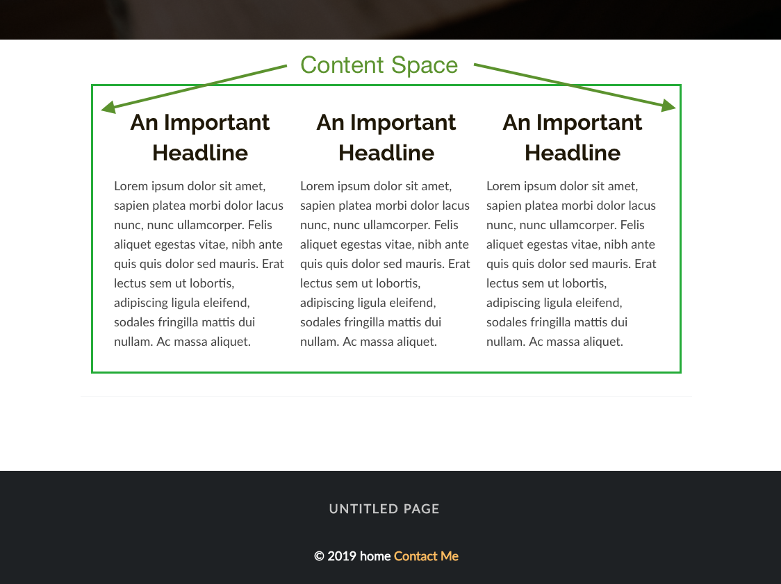
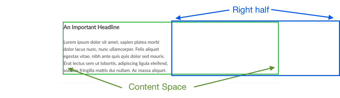
In the “Layout & Size” section choose a layout. Each option refers to the the content space. This space is where your stacks content boundaries are. It will be different depending on the theme or framework you are using. In the image below, the theme restricts the content space to the center.
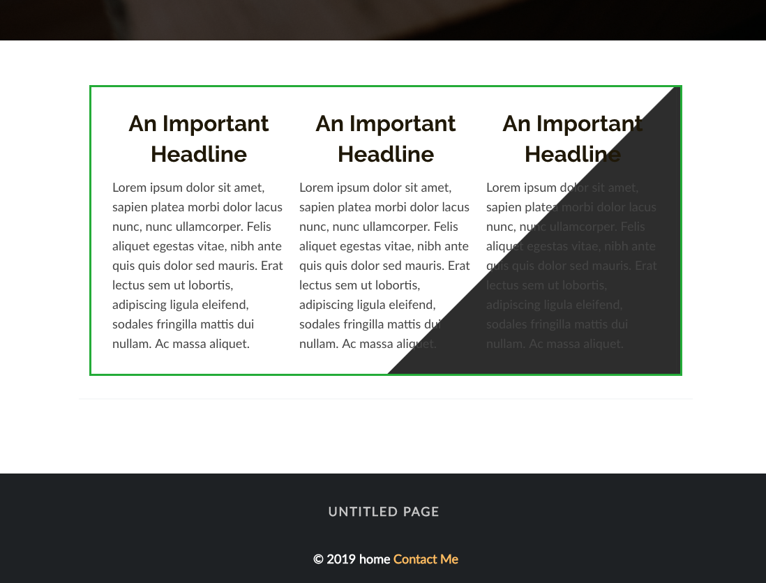
Setting the layout to “Right half” means the shape will fill the right half of the content space. In the image below you will see that the left edge of the shape is in the center of the content space and the right edge is at the right of the content space.
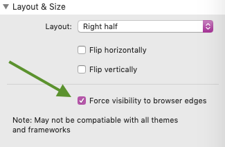
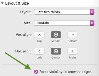
Because we are using a theme that restricts the content space, we will need to enable “Force visibility to browser edges” to get the edge to extend to the edge of the browser window.
This option only needs to be enabled if the edge of the shape does not extend to the browser edge. Though Image Sector has been tested in 3rd-party themes and frameworks, there may be a few themes that have display issues. If you have any trouble feel free to contact our support and we can add support for your specific theme or framework.
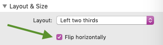
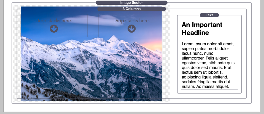
In our example, we are going to set our layout to “Left two thirds”. Because we are using a left layout we will need to flip our shape horizontally so that the edge extends the the left instead of the right.
There is also an option to flip the shape vertically to turn the shape upside down. In our example we will not be flipping it vertically. We will also remove left and center column content from our 3-column stack so that the space above our graphic is empty.
After that, we will need to style our shape by giving it a color or adding a background image. If you add an image, you can align the image vertically or horizontally inside of the shape. The image will automatically scale and clip to fill the entire shape.
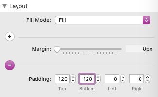
The shape will always match the height of your content, in our example it is matching the height of the text on the right. For greater effect, you can add padding to the top and bottom of the Image Sector stack to have it extend past the content.
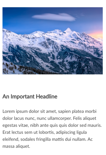
Lastly, you may want to adjust the responsive behavior. By default, any screen smaller than 770px wide will have the shape removed and the image (if one is set) placed at the top of the content.
Other options are to have it placed as an image below the content, used as a background image, keep it as a shape making no adjustments, and removing the shape and image all together. After selecting an option that best suits your design, setup is complete. See the Settings menu breakdown below for more info on the different options.
Image Mode Setup
To get started, add the Image Sector stack to your stacks page. By default the stack is set to Edge mode. Click in the “Image” button to switch.
While in Image mode, it should not be placed inside of another stack. Placing it inside of another stack may disable the ability for the graphic to extend past the content space of the theme or framework you are using.
In the “Layout & Size” section choose a layout. Each option refers to the the content space. This space is where your stacks content boundaries are. It will be different depending on the theme or framework you are using. In the image below, the theme restricts the content space to the center.
Setting the layout to “Right half” means the image will be contained in the right half of the content space + plus the space to the right of it extending to the browser’s edge.
In our example we are using a theme that restricts the content space, we will need to enable “Force visibility to browser edges” to get the image to extend beyond the content space.
This option only needs to be enabled if the image is being cut off. Though Image Sector has been tested in 3rd-party themes and frameworks, there may be a few themes that have display issues. If you have any trouble feel free to contact our support and we can add support for your specific theme or framework.
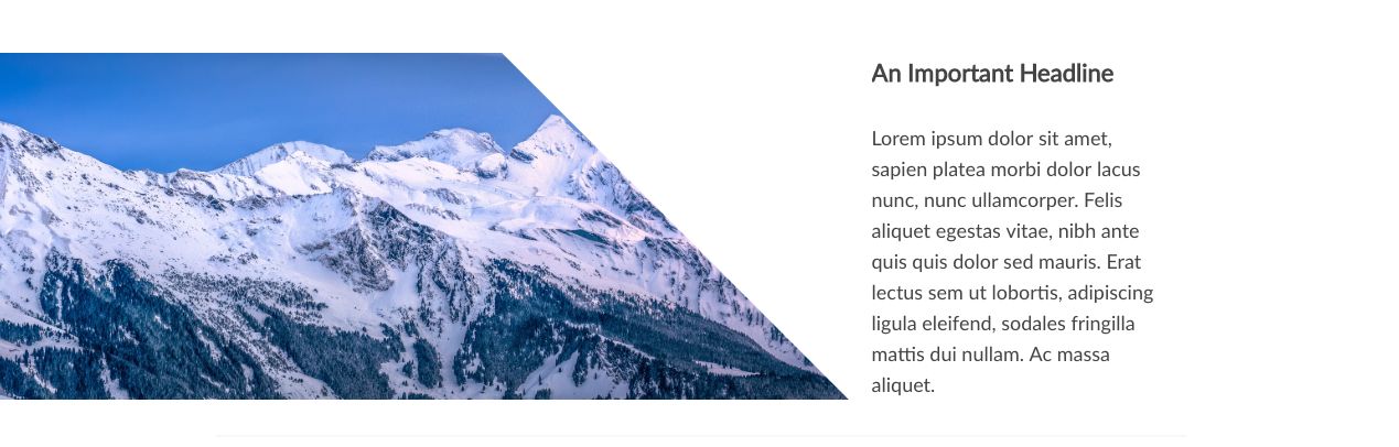
In our example, we are going to set our layout to “Left two thirds”. Inside the Image Sector stack we will place a 3-column stack and only place content in the right most column so that the image does not have any content over top of it.
Now if you switch to preview mode you may notice that the image appears quite small. This is because by default, the size is set to “Contain”. The image will resize to match the height of your content, in our example it will match the height of the text on the right. For greater effect, you can add padding to the top and bottom of the Image Sector stack to have it extend past the content.
If you want the image to always be a specific size, you can use the Size option and select “Define width & height” to set specific dimensions.
After that, we need to adjust the alignment of the image. By default it will be centered in the defined layout space. Use the alignment options to adjust where the image displays.
Lastly, you may want to adjust the responsive behavior. By default, any screen smaller than 770px wide will have the image placed at the top of the content.
Other options are to have it placed as an image below the content, used as a background image that covers the entire width of the screen, keep it as a background image making no adjustments to its position, and removing the shape and image all together. After selecting an option that best suits your design, setup is complete. See the Settings menu breakdown below for more info on the different options.
Shape Mode Setup
To get started, add the Image Sector stack to your stacks page. By default the stack is set to Edge mode. Click on the “Shape” button to switch.
While in Shape mode, it should not be placed inside of another stack. Placing it inside of another stack may disable the ability for the graphic to extend to the edges of the browser window.
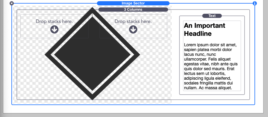
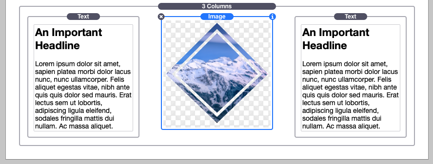
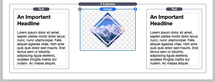
Next select a shape to use. You can also select “Custom” to add your own, more info on that in the “Creating custom shapes” tutorial below. In this example we will be using the “Diamond” shape and placing a 3-column stack inside Image Sector.
In the “Layout & Size” section choose a layout. Each option refers to the the content space. This space is where your stacks content boundaries are. It will be different depending on the theme or framework you are using. In the image below, the theme restricts the content space to the center.
Setting the layout to “Right half” means the shape will fill the right half of the content space. The shape will always be contained inside of the the content space unless the “Full browser width” layout option is selected.
If you are using the “Full browser width” layout option and using a theme that restricts the content space, you will need to enable “Force visibility to browser edges” to get the layout space to extend to the edges of the browser window.
This option only needs to be enabled if the shape is being cut off when you preview it. Though Image Sector has been tested in 3rd-party themes and frameworks, there may be a few themes that have display issues. If you have any trouble feel free to contact our support and we can add support for your specific theme or framework.
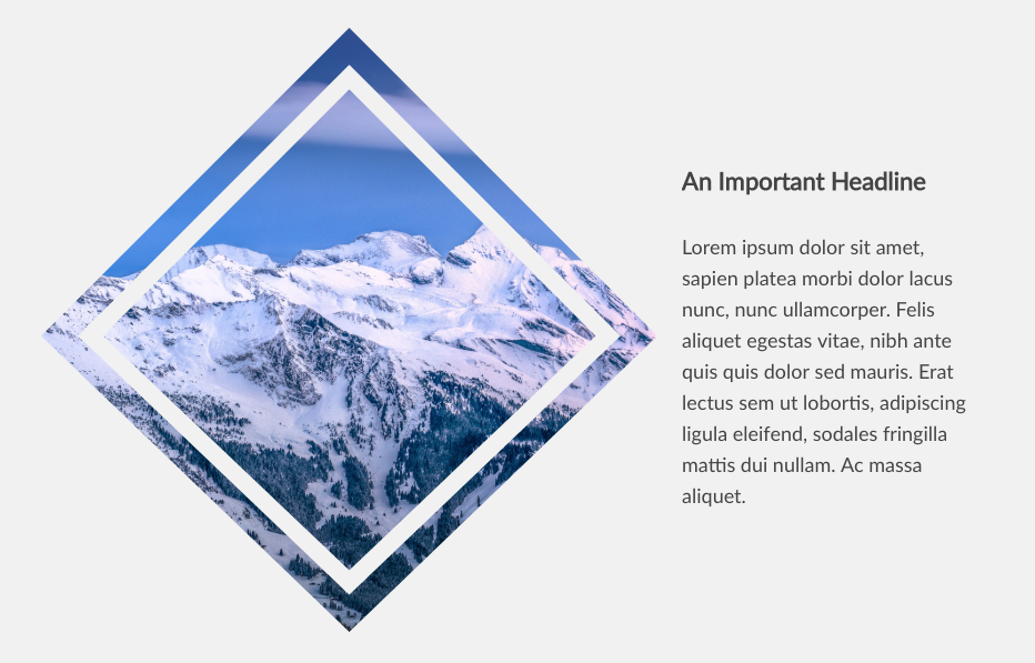
In our example, we are going to set our layout to “Left two thirds”.
By default the size is set to “Contain”, this option will automatically fill as much space as possible without clipping or distorting the image. If you want the iamge to always be a specific size, you can use the size option and select “Define width & height” to set specific dimensions.
Next, use the align options to adjust where the shape displays in the defined layout area.
There are options to flip the shape vertically and horizontally as well as rotate it by 90 degrees, but since our shape is symmetrical, non of these options will have much effect . We will remove the left and center column content from our 3-column stack so that the space above our graphic is empty.
After that, we will need to style our shape by giving it a color or adding a background image. If you add an image, you can align the image vertically or horizontally inside of the shape. The image will automatically scale and clip to fill the entire shape.
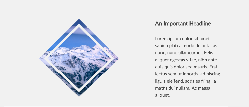
The shape will always match the height of your content, in our example it is matching the height of the text on the right. You can add padding to the top and bottom of the Image Sector stack to have it extend past the content.
Lastly, you may want to adjust the responsive behavior. By default, any screen smaller than 770px wide will have the shape removed and the image (if one is set) placed at the top of the content.
Other options are to have it placed as an image below the content, used as a background image, keep it as a shape making no adjustments, and removing the shape and image all together. After selecting an option that best suits your design, setup is complete. See the Settings menu breakdown below for more info on the different options. If you would rather keep the shape somewhere in line with the content, you may want to see the “Object Mode Setup” tutorial below.
Object Mode Setup
To get started, add the Image Sector stack to your stacks page. By default the stack is set to Edge mode. Click on the “Object” button to switch
Next select a shape to use. You can also select “Custom” to add your own, more info on that in the “Creating custom shapes” tutorial below. In this example we will be using the “Diamond” shape.
By default the size is set to “Contain”, this option will automatically fill as much space as possible without clipping or distorting the shape.
If you want the shape to always be a specific size, you can use the size option and select “Define width & height” to set specific dimensions.
Next, select a horizontal alignment for the shape.
There are options to flip the shape vertically and horizontally as well as rotate it by 90 degrees, but since our shape is symmetrical, non of these options will have much effect.
The “Force visibility to browser edge” option is for the other modes and should be left disabled.
Lastly, we will need to style our shape by giving it a color or adding a background image. If you add an image, you can align the image vertically or horizontally inside of the shape. The image will automatically scale and clip to fill the entire shape.
Settings Menu
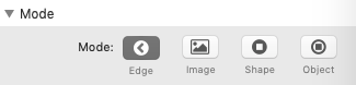
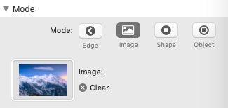
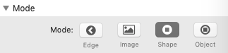
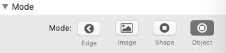
Mode: Choose from 4 distinct modes.
- Edge creates large background graphics that extend to the browser edge.
- Image allows you to place large images that sit outside the content area.
- Shape creates large background graphics that are contained inside the content area.
- Object creates shapes that behave like images and can be placed inside any stack that supports content.
Shape (Edge/Shape/Object): Choose from a predefined shape or select “Custom” to use an included icon path or to add your own path created with the shape tool.
Shape Path (Edge/Shape/Object): Available when the “Shape” option is set to “Custom”. Paste an included icon path here or paste a path created with the shape tool.
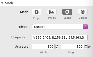
Artboard (Shape/Object): Available when the “Shape” option is set to “Custom”. By default, the shape tool artboard is set to 500px by 500px. If you wish to create different sized shape, you can adjust the artboard size in the shape tool. You will then need to copy the artboard size into these fields.
Layout (Edge/Image/Shape): Define the area you would like the background graphic to fill.
Size (Image/Shape/Object): Allows you to either set the graphic to automatically fill the selected layout area with the “Contain” option, or define a specific width and height.
Dimensions (Image/Shape/Object): Available when the “Size” is set to “Define width and height”. Allows you to define a width and height to the graphic in a pixel value.
Ver. align & Hor. align (Image/Shape): Change the alignment of the graphic inside of the defined layout space.
Flip horizontally/Flip vertically/Rotate 90 degrees (Edge/Shape/Object): Optionally change the direction of the design. This option is most useful for asymmetrical shapes.
Force visibility to browser edges: Forces the theme or framework to allow the graphic to extend outside of the defined content area. This option only needs to be enabled if the shape is being cut off by the content area. Though Image Sector has been tested in 3rd-party themes and frameworks, there may be a few themes that have display issues. If you have any trouble feel free to contact our support and we can add support for your specific theme or framework. This option should be ignored and left disabled if you are using the “Object” mode.
Creating custom shapes
A shape tool is included when you download the stack. You can also use the online version found here: shape tool
With this tool you can create your own shapes to add to the Image Sector stack.
The artboard is 500px wide by 500px tall by default and starts with a single point shown as a green dot. To add new points hold down the command key and click anywhere on the artboard grid. The artboard can be adjusted for Shape and Object modes. For Edge mode the artboard must be set to 500px by 500px to work properly. Your design must also include a point at the top right and bottom right of the artboard so that the graphic can extend properly to the edge of the browser.
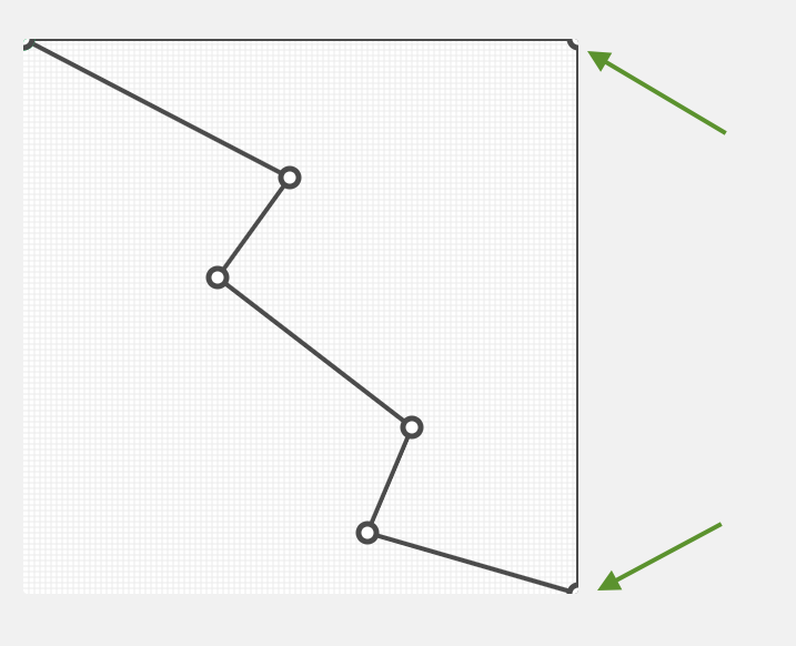
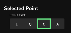
Each new point can be set to 4 different types. “L” is for “Line” and will simply be a straight line from the previous point. “Q” stands for “Quadratic Bezier” and will give you two handles to adjust the S curve of the line leading up to this point. “C” stands for “Cubic Bezier” and will give you a single handle to adjust the curve of the line leading up to this point. “A” stands for “Arc” and will create a circular shape between the selected point and the one preceding it.
Continue to add more points and adjust them to create a completed shape. Make sure your design covers most of the artboard space so that it can scale properly inside the Image Sector stack.
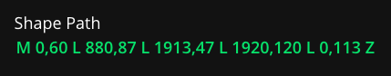
Once you are satisfied with the design, copy and paste the “Shape Path” into the Image Sector stack’s shape path field. You can then use the stack’s settings menu to adjust how the shape fits. If you have adjusted the artboard size, you will also need to copy over the artboard dimensions in the the “Artboard” fields.
Shape tool settings
Width and Height: Adjust the size of the artboard. If this value is changed, you will need to update the “Artboard” fields to match in the stack settings menu.
Close path: By default the shape will automatically be closed. Disable the “Close path” option if you would like to close the path manually after completing the design (By adding a new point in the same exact position of the starting point).
Grid size: Adjust the size of the grid lines by px.
Snap grid: When enabled, newly created points and points that have been moved will automatically attach to the closest grid intersection.
Show grid: When enabled, grid lines based on the grid size will display on the artboard.
Reset Path: Will remove all the points from the artboard except for the starting point.
Point x position: The position of the currently selected point along the x or horizontal axis.
Point y position: The position of the currently selected point along the y or vertical axis.